
The Power of Color Psychology in Interior Design

Did you know that color can significantly impact our mood, behavior, and productivity? Harness the power of color psychology in your interior design with these tips:
1. Blue for Calmness
Incorporate shades of blue to promote a sense of calm and tranquility. Blue hues are known to reduce stress and encourage relaxation, making them ideal for bedrooms, living rooms, and meditation spaces.
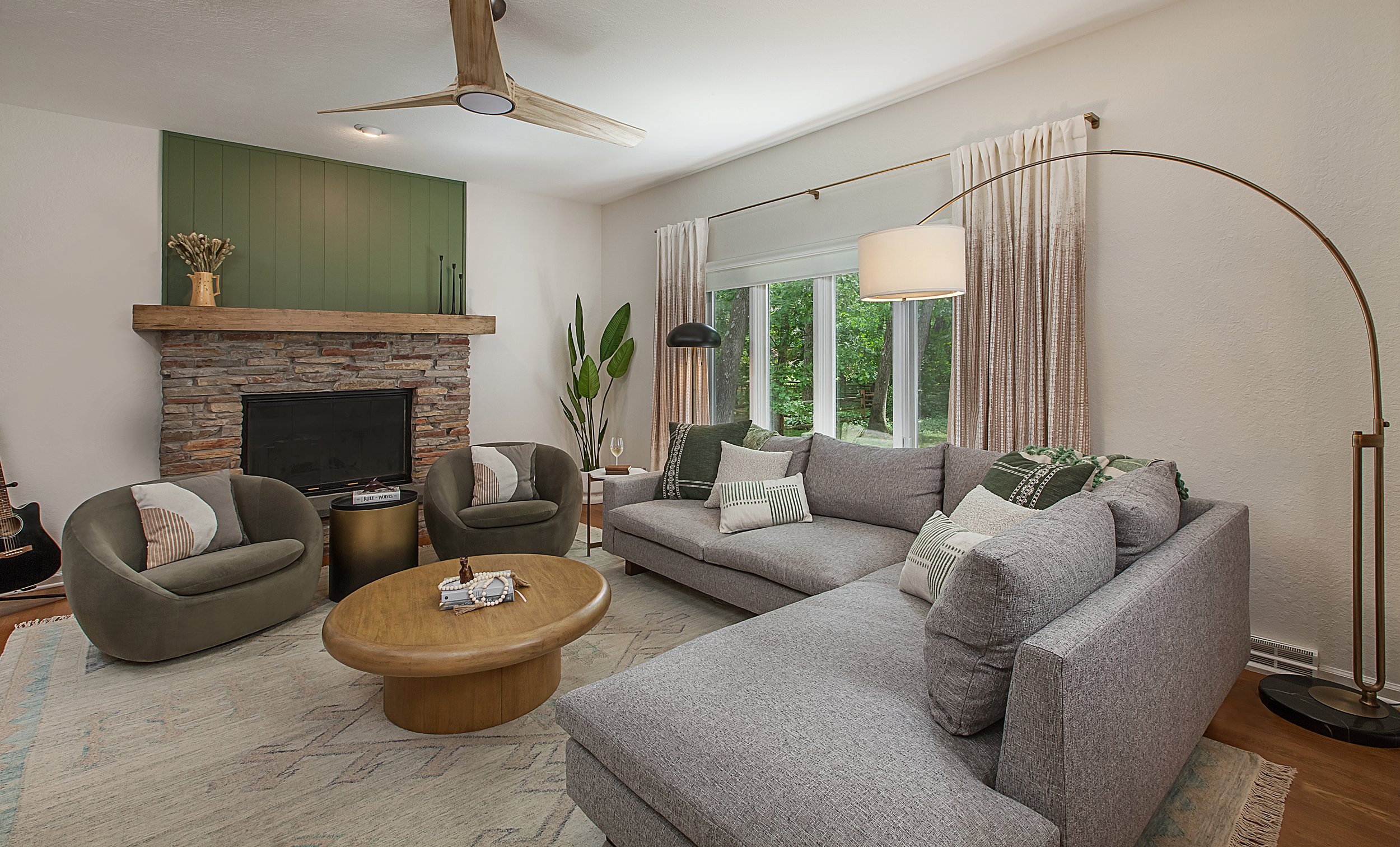
2. Green for Balance
Bring the rejuvenating energy of nature indoors with green tones. Green is associated with growth, balance, and harmony, making it a perfect choice for offices, study areas, and areas where focus is essential.
3. Yellow for Positivity
Infuse your space with warmth and positivity by adding touches of yellow. Yellow is known to evoke feelings of happiness, optimism, and creativity, making it a great option for kitchens, dining areas, and creative studios.
4. Neutral for Versatility
Create a versatile backdrop with neutral colors such as beige, taupe, and gray. Neutrals provide a timeless elegance and serve as an excellent foundation for layering textures, patterns, and accent colors throughout your space.
5. Red for Energy
Add a pop of energy and vitality with accents of red. Red stimulates the senses, increases heart rate, and promotes activity, making it a suitable choice for workout areas, dining rooms, and social spaces.

At CBH Interiors, we embrace the power of color psychology to design spaces that uplift, inspire, and empower. Share your favorite colors and their effects on your mood in the comments below!